It's been a long time since we've rock and rolled like this, and long enough that we have a couple goodies waiting for your votes. Check this: After the brisk closing-down of The T-Shirt Vault, our once-suggested purchase from the_jcw has now become an awesome piece for your votes at Design By Humans: "
Our Urban Environment." Not only that,
The Lost Beach by Opifan64 and
Forbidden Melody by Fikri are both up for your love and votes at Tilteed. That's like, a faceful of awesome.
 Tilteed
 is also leading off the pack this week in new blood, as well, which I am all for. While a solid crop of new designs makes selecting winners more difficult for the site, it also means people are finding the dichotomy of curation and contest easy to handle. The piece that's struck me most in recent weeks is edgarscratch's "
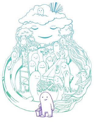
Bird Town." It's got a simple style that is simply enthralling to me, even in the greyness of the piece. It all feels very cultured, maybe a little European, and I really like how the illustration is framed by the bird's silhouette. The moon functions as an eye, while the night sky shades and highlights the head. Also, the focus on the roofs of the little town recalls the bird itself, and its own neighborhood within the town. It's well thought out, attractive, and classy. Sort of like your correspondent. How -can't- I like it? It's been up for a while (notice I haven't been here for a few weeks?) but it still deserves your love.
 Threadless
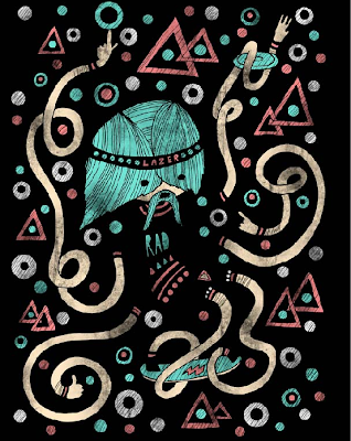
, for it's sake, totally brought its A-game this week after a few weeks of really letting me down overall. Sure, it's in the middle of a totally arbitrary contest about making sandals, leading to a whole bunch of designs ABOUT sandals, or which only look interesting ON sandals (is no one thinking of the real fact that the sandal prints are going to be covered by your feet and ergo invisible during normal use?) but even so, we got some totally sweet work, and I've 5'd more pieces this week than in most entire months lately. Let's keep this awesomeness up, y'all! Let's start off the awesomefest with someone who has become a regular 'round these parts: Mr. Randyotter3000. This week brings us
RAD, which sums up the design 100-fold. This thing is indeed rad-tastic. The character is some sort of bodyless hippie shaman dog or something. That's fine by me, because it totally fits in the overall feel of this piece. I kinda feel like I'd feel like a bodyless hippie shaman dog in it, and I think that's an experience worth striving for if you can get it without the drugs. The image definitely delivers there... it looks like the party of the century, yet only in dog-man's mind. The colors are far and away the selling point here... they're absolutely wonderfully saturated and yet well-vintaged. The shades pop brilliantly and yet sink naturally into the black blank, like worn neon, if such a thing could exist. I can't imagine this not making an amazing, fun, colorful-without-being-annoying tee. I'd buy it, and I'd throw a party the next day just to have an excuse to wear it.

Playing the role of "Threadless Gold Standard" tee of the week is
Wishful Thinking by WanderingBert. Here's what I mean by that: Threadless has a certain style that they are really known for. Simplicity is part of it. Solid concept is another. Smart humor is a third. And this combines all three. The style is spare and simple, letting the concept's humor shine through. It doesn't try too hard to make a joke. It doesn't overload the senses. It's subtle and intelligent. And what's really nice is that it is a CREATIVE concept. The genie here, while certainly borrowing imagery from the Disney representation, nevertheless does not rely on that. This isn't about -that- genie. It's about -a- genie. These days that's a huge, important distinction. This shirt is about the interaction here, not about selling to rabid Aladdin fans. It's a direction I'd love to see Threadless' humor catalog turn back to. This is familiar because the concept is understandable. I think we can still go back to that and be creative. I certainly hope so at least.

Finishing the Threadless portion of tonight's blog, we have something epic and out of the ordinary from DaleEdwin.
If Thine Eye Offend Thee... is one of the most exciting potential Threadless tees I've seen in a long time. It's all about departure: in some ways it's even a departure for the designer. There's a lot of his trademark style, and I don't think anyone familiar would not be able to tell it was his work, but it feels a lot darker, a lot more industrial, a lot creepier than his often lighthearted work. Then again, it's also a lot darker than a lot of what Threadless itself prints, but it's simply too awesome to go unnoticed. It's incredibly striking, especially since it's limited color palette nevertheless is made up of two perfect colors. The green adds to the toxic, industrialized feel of the piece, creating its own layer of creepiness for the proceedings, and the off-white smoke and drip complements the black and green while also making the "gore" of the image less realistic and more acceptable. The other elements of the design are no less striking, though. The motion in the central act of eye-poking looks as lovely as such an action can look, the pipes and wires and tubes flow wonderfully, but I'm most enthralled by the empty heads. They're haunting, both unsettling and irresistible to look at. They frame the entire scene and scenario in their vacant stares. This is serious awesome, and it simply must see ink.

Equally epic comes from
shirt.woot this week, which is exactly why it didn't print and is in my blog for you to rage rage against the dying of its light. Simply titled
Sentience, this has the luck of having two brilliant tablets handle it. The collaboration between Robbie Lee's classic textures and robots and Edgar R. McHerly's crazed, joyful dreamscapes really brings in the best of both epic worlds. The contrast of styles is perfect given the world-of-imagination concept at work. Robbie handles a detailed central scene of creation, while Edgar frames it all with whimsical images of what might go on inside that newborn cybernetic imagination. As we can see, this sort of android dreams of electric androids. It's all perfect. I defy one to say otherwise. The colors? Perfect. The purple is vibrant and exciting, and offsets the grays of the "real" world with a boldness in the dream one, and lets be honest, I've been a fiend for white tees lately. The layout? Perfect. Massive swaths of white make it incredibly breathable despite its shape, and the solidness of the frame is highly appropriate for the concept, as well as being edged to give even its solidity some intrigue. The only negative to this design is how it is not in existence yet, because when it is, it will be mine.
Speaking of shirts being mine, some sweet ass Tilteed tees can be yours if you take part in our contest outlined in our last post. Just send ol' Adder a pic of you in your favorite Tilteed Limited, and get entered to win one of two Tilteed tees of your choice. More on that in my last blog. But you shoulda been looking at that anyway, eh?
 Ideally, Contest Watch will be back in the ring next week. We (in the royal sense) have been pretty out of it with the reliability of late. Lots of busy and lots of exhaustion, combined with lots of really mediocre and uninspired work. It's been hard to really get stoked for the voting when even the most inspirational designers seem to be unable to do anything worthy of those skills. Repeat after me: "my skills are dramatic enough that I don't need to only draw other people's characters." Feel better? Great. Now to move on.