...

Sunday, February 28, 2010

Snails!

Our current Tilteed Limited is a pretty simple piece with a pretty silly name: When Zombie Snails Attack. It's brought to us by BCHC, who states that this is his first official design not directly linked to the hardcore music scene. We're happy to be bringing it to you.
What I like so much about BCHC's work is how he is able to arrange elements and motifs to create similar but different work. There are themes of shelter (often buildings, though the snail shell itself is certainly its own shelter) as well as nature (the coral/weed/etc framework of this piece, for example, and the snails themselves, again). It creates a peaceful, rustic feel, regardless of the title, and everything arranges beautifully and logically. This is by far one of my favorite renditions of the theme, and we hope you'll love it like we do. Just make sure to love it by March 3rd at Noon Pacific, or there will be no time to get one.

Saturday, February 27, 2010

Editor's Choice: The aftermath '10 - 1

There are lots of reasons why shirt.woot should subscribe to the Editor's Choice philosophy for EVERY derby. From a pure sales perspective, it wouldn't be that different. Every shirt that went up for sale this week outsold the first-day numbers of at least one of the actual voted winners, which means, simply put, that the most popular shirts vote-wise are not necessarily the most popular woot-wide. If woot can get similar sales numbers whether utilizing votes or their own tastes, I see no reason not to go with their own tastes.

That leads into the real reason for more woot control in derby prints, though... simply put, woot selects more awesome pieces than wooters do. Sure, they have the occasional dud, like anyone, but overall the quality is dramatic in its discrepancy. Look at Flying, by ilovedoodle. This is easily one of woot's most charming and well made pieces. The color palette is lovely and subtle. The execution is crisp and striking. The layout is economical while also being complete: that is to say, a lot of canvas space is used, but the fill is tasteful and subtle. Also, there's much to be said for the layers. The coral and waves and cloud all stack like a parfait of whimsy, and the whale, rays, penguins and birds all occupy their positions perfectly. It's a piece that is almost too elegant for woot, which is why it could stand alone as reason enough for woot to always pick editor's choices from every derby instead of the mediocre work the voters choose. This is an undeniably worthy print.

Also undeniable in its own way is Omnitarian's Taco Cat, which is probably one of the most bizarre character tees out there. That's what I love about it, though. The palindrome it's based off of conjures such a perfectly odd image that the resulting construction is wonderfully appealing simply for the oddball image it puts forth. It works without getting the title because it really is a pure nonsense character. This sort of nonsense character, however, is the sort of character which should stand alone on a tee. It's striking in color and style, making it worth looking at, and it's unique enough to be intriguing to the eye and ergo intriguing to the wallet when considering a purchase. Being unique is the best thing a stand-alone character on a t-shirt can have going for it, because it gives the character a power that a trademarked character would have. It's distinctive enough to work. And when that distinction is that you're part taco, it's also delicious enough to be a must buy. It stands out in woot's catalog, and that alone is reason enough to print it. Without editor's choice prints, this would never exist, and almost unarguably, it deserves to more than most prints do.

As always with woot and my choices therein, I don't expect these to last past next Monday, the 8th, so if you dig 'em, snatch 'em up now. There's always a chance that you might luck out and find one available past then, but that simply should not be a risk we take on great shirts.

Thursday, February 25, 2010

MOUTHFAAAACE!

So, what better way to use our 300th post than with one of the first tees we fell in love with here? Mouthface, by Hands_on_Fire, is finally printing, and it's doing so at what would be my favorite little site out there even if I wasn't affiliated: Tilteed.

Sadly, it's a limited tee, which means it's only available for 72 hours (Sunday, 12pacific, for those uncertain), but that doesn't make it less awesome. The characterization on the piece is brilliant, with so much friendly charm in the creepy, crazy characters. There's even a little Rat Fink flair in mouthpet, funking up the seemingly indie-cool, hoodie-rocking mouthface himself. Or herself. The illustration is top-notch as well, allowing this bizarre creature to take shape and come alive. It's totally unique, and pretty damn wearable in its own right. I can't wait to get mine.

As I recall, this is the third tee to print from our first contest watch ever. I feel as though that should be my next goal... find a way to get the last two printed. But for now, let us revel in this one, one of the first tees I truly needed from my blog days. Don't forget to pick one up... you'll regret it if you don't.

Monday, February 22, 2010

Personal Space

Threadless has done a very wise thing in showing us, the Contest Watching Public, a new coup this week. "...Well, I'm Just as Confused as You Are," a Biotwist piece made of awesomeness, is among the new selections. It's amusing, well executed, and purple. I presume all of you will be on board for at least one of those reasons.

One thing I like here, besides the strong "WTF" moment of the concept, is how otherwise natural everything would be without the other helmet-man. The diver's shrug is more pronounced, but you can get the feeling of his sinking to the ocean floor while its buoyancy is lifting his limbs, and the astronaut may be pointing, but it seems a natural "I'm floating in freakin' outer space" gesture. They're surprised by the meeting, but otherwise nonchalant about it. It's a great little detail that makes a great little tee greater.

Friday, February 19, 2010

Apres Mains Le Deluge

We're not always entirely happy when we see contest watch pieces go to print. Sometimes the piece has been altered since the original vote period, and sometimes that alteration is for the worse. Sometimes site limitations force a change. So it goes in the fickle world of tees.

So too it went for Fat Pigeon, creator of Like Water Through My Hands. While I give props where due to RIPT for picking a decidedly more feminine piece up at all, I really wish the piece had more of the nuances of color that the original showed, especially the pinks in the flowers. That said, of course, this is not a disaster, because the piece still does what it sets out to do, and does it beautifully. The hands still gleam like porcelain, fragile and pure. The water still cascades fluidly. There is still a sense of peace and calm to the design, and while I personally hope that it'll see print as originally intended in the future, if things go as shown here, the newer rendition could be just as successful. Just remember that, like water through your hands, this design will slip away in 24 hours, as all RIPT designs do, so be sure to bottle it up before you lose your chance.

Fast and Speedy Wins the Race


Today's Tilteed Limited debut is RACE, by childmirror, a piece I loved a long long time ago, and one I bring to you all now in hopes of showing a few things. First, note the concept. It's a long-standing tradition to take on the tortoise and the hare: some things are so familiar that people latch on to them to sell their work. Yet here, it is solely a reference. It's not about lol turtles are slow, but it's re-imagining that race entirely. The tortoise isn't winning on a technicality... he's spanking a whole slew of rabbits on his own abilities. It's like a revenge match, a continuation... there is more artistic input here than your average rendition. Also, however, note the style. It's appropriate, given the artist's handle, that the design is youthful, playful, cartoony, even, dare I say it, cute. But that cuteness comes forth in an organic way, and an actual way. The rabbits are still intent on their futile prize, fighting along in the surf. There is expression, and there is a simple but definite style at play. All this in a simple one-color piece. There's a lot to like about this design (right down to how the cadre of bunnymen are coming from the side of the tee, making it look like an infinite assault, all still destined to lose), but it really showcases how a concept can have life breathed into it simply by approaching it creatively and artistically.
As always, if you're one who approaches things creatively and artistically, I'd love to hear from you, so drop a line at Adder (at) Tilteed (dot) com if you want to pitch me some designing awesomeness. If you're more about wearing something that takes that approach, however, definitely pick one of these up quick. They'll all swim away Monday, Noon PST, to make way for the next long awaited Tilteed contest print (which even I am excited for, since I have no clue what it is myself. Yay surprises!)

Thursday, February 18, 2010

Contest Watch Extra! Week of February 11

It's a bit odd to call this an "extra" week when, in reality, it was fairly slow for true awesomeness. There was lots of great stuff, but most of it was difficult to commit to: pieces I really want to see in person before I can honestly sit down and say "yeah, this is as awesome as it looks," which doesn't stop me some weeks, but this week, it was just enough weirdness to make me have to take a step back.

One of the highlights of the week: seeing Omnitarian's Penguins and Waffles, Together at Last get a shot up at Threadless. It needs some love to have a shot at printing, but it is truly deserving of that print, so try and get out there in the last hours of its run. We'll get back to that stuff later, but we have new work to highlight as well.

For one reason or another, one of the designs that intrigued me this week was from newcomers Inkblitz. It's been hard to find amazing work at smaller companies... some have been inactive for too long, others just can't attract awesome, but something about sjorsvervoorts' aptly named "Monster Climbing a Building" struck me as oddly appealing. It might be the monster itself, built from a helmet or poolball or possibly one of those things that shoots balls of air at people, and given that it is the focal point, the bold splash of color against the tee, that seems probable. I also like the mix of styles, though... there's a simplicity of both concept and execution that just works for a design like this. Finally, while it shouldn't need to be a concern, the positioning alleviates certain, er, "issues" that this could "rise up" with if it were a placed a bit lower. Overall, a simple piece that simply appealed for some reason or other.

Threadless is unsurprisingly taking the bulk of the tinytownean recap this week, but with designs like fikri's Forbidden Melody!!! it shouldn't be too shocking why. This is definitely in the spirit of blog fave and DBH print Metal on Metal, but far less dark if equally gritty. If I haven't said it before, music is my first love, and this Kim-Thayil-esque mountain man axe-wielder recaptures many of the images one conjures up when they think of rock and roll. What makes this different from Metal on Metal is the palette, for starters... the other is dark and bold, while this is brighter, less saturated, almost stonewashed like the player's jeans, yet the music is still powerful, still alluring, still full of awesomeness. I love the additions throughout this design, especially in the streams of guitar: lightning, skulls, hands... The positioning on this one is great too, coming in from the side. Threadless tends to take either a simple route or a nerd route when it comes to music related tees, so something like this would stand out in their catalog, yet fit with the aesthetic I feel their community has musically. It might not be the hippest representation, but it certainly puts forth the passion of a musician or music fan, and certainly has its place in their catalog for that reason.

However, the easy favorite of the week was a wonderful little concoction from ginetteginette. The piece is entitled Lumps Bathing in Their Favourite Pond, and well, it certainly fits. One of the things white shirts can do exceedingly well is both temper and brighten colors this bold: it's like a palate cleanser for those who might find uber-colorful pieces hard to appreciate, while at the same time it's blank slate allows those bold, saturated tones to shine forth purely. Therefore, designing this gumdroppy sunshiney world on a white blank really helps it become all the more wearable and wonderful. Not that it really -needs- that help... this is the sort of candy wonderland we probably don't want to admit we still dream about. There's really nothing ostensibly sugary about it, but the colorscape gives that edible feeling. The flow of the world is engaging, also. The bold colors draw your eye everywhere, but the details keep you there, and the simple shapes of the world and its denizens both make all that darting around easy. All that, and it even fills the blank in a way that a bold piece of charming psychedelia should. I am a huge proponent of pieces like this that create a whole new world of awesome and imagination... it evokes any number of tees that feature magical personal worlds that we the viewer simply would love to inhabit, from Timberland to really any number of Aphte designs, and as with so many of the designer's most visually successful pieces, it combines her more out-of-the-box style with an inarguable appeal. It's wearable and unique at once, and it would be a crying shame if Threadless did not find this in its stocks sooner than later.


And now, to the part our regular viewers expect on weeks like this: our extra hopefuls for shirt.woot's Editor's Choice week, starting Monday. As of posting, it's uncertain what we'll see print via vote, but the choices tell me one thing: we're gonna need to rely on ECs if we want to really save amazing shirts. In an ideal world, I'd love to see these: rglee129's Reboot, a stunning one-color which should have been woot's first print of the new year; Omnitarian's Taco Cat, probably the most charming food-based character ever; Mathiole's Independence, one of the most beautiful designs EVER subbed to woot, and a crying shame if they don't realize it; and ilovedoodle's Flying, which has more charm than marshmallow cereal, and proves that you can do cute, and super-cute, while maintaining personal style and quality control. These are diverse in derby origin, styles, and even shirt blanks, and while there are certainly other worthy pieces that could take these pieces' places, woot could not pick a more flawless round.

Wednesday, February 17, 2010

Ride 'em Cowbot

Another longtime, much batted-about design, along the lines of Ninthwheel's Caesium, is a.mar.illo's Troybot. I've seen this make the rounds at about every site there is, always scoring well, always coming up short, so it is with great pride and joy that I get to say it finally has seen print as the latest "Tilteed Limited" tee. This means your time is, well, limited, and being a Lazy McLazy, nearly half that time has expired already (sorry guys), but it also means that if you grab it before Friday, Noon Pacific, you'll get it from probably one of the best sites out there, and that's a bias my loyal readers should know I've had since long before becoming a curator.

a.mar.illo's style is pretty wonderful to begin with, but the glow of the colors here makes it all the more so... It's all about color choice, not gimmicks, that makes this robot gleam, and the details capture the imagination as well. It's a solid shirt for just about any taste, but hey, if you're really into horses, you should consider picking up Mitohapa's excellent (and Contest Watch fave) "Ghost Town Cactus Trio" as well. For the month of February, buying two or more Tilteed tees saves you $4 a pop with code "FEB50," making the combo of awesome horse-some tees all the more appealing.

Monday, February 15, 2010

Caesium: The Day

Sometimes here at the blog, it's clear when a contest watch tee is destined to print. It's obvious by the comments, the theme, the overall feel of the score's potential. There are indeed also times when I know that even the most flowery blog will not save a design... it won't score well and won't print, and I can only hope my words highlighted it for some other company to fall in love with it and offer it a chance. And then, defying both sides, there is ninthWHEEL.

NinthWHEEL, in any of his many capitalization schemes, has held the dubious distinction of now twice printing against all odds. His Final Approach found a home at Woot after being shopped just about everywhere else (which was ludicrous, as it was a brilliant piece), and now, we can finally celebrate Caesium-137's long-overdue print. Like the other, both tees feature birds of prey, but the more important similarity is how both went through hell and back and any number of modifications before finally becoming a real live print. Unlike some tees, there was no reason for this one NOT to print, even though it was also never sure it would, so after so much rejection, this is like a miracle, and a well deserved one.

Design by Humans does the piece proud... a nice huge graphic with the stoic bird against the modern, angular laser-trail, and on a hunter-green blank that looks like it'll be killer in person. I can't wait to see it. If you're as impatient as I am, don't forget to pick one up. To sweeten the pot, we do still have a DBH coupon code going: 37D0MG (That's with a zero) will get you an additional 10% off your purchase until this Thursday, Feb. 18. It's take long enough to get this shirt to the chests of the world... don't go wasting more of it.

Saturday, February 13, 2010

I Want Your Skull


Shirt cliches: Wolves. Tigers. Dragons. CMYK. Recycled slogans. Before all these, however, came the skull. The skull ruled the roost, and the exposure made the skull trite. In the wake of the damage the Ed Hardy empire has done to the once powerful skull empire, we at Tilteed bring you a shirt that strikes back.
Esskayeesee's "Skull Shirts are Lame" is a lovely meta design that takes that phenomenon to task. The skull considers his past coolness, lamenting what has happened to him, both in the overuse of his image and the debauching of it in the hands of the Hardyites. Yet in calling attention to this ruination, the shirt makes skull tees fresh again: the simple palette is smart and pops off the bold mint blank, and the style is playful, not over-serious and overwrought. That really pushes the concept forward, and makes the shirt stand forth as its own message, both of stopping the overuse of the image, and showing how even a tired image can still be made special. But if you think it's special, too, you best get on it ASAP... it's only gonna be around for 72 hours.

Friday, February 12, 2010

Hair Today

When you have 365 designs, you're bound to have a bunch of winners, and when you're Flying Mouse, that's at least doubly true. You should really all be watching the Flying Mouse 365 shop weekly for this reason, but in case you haven't been, this week there's another reason to do so.

You may recall Looking for New Hair Style from our contest watch segment in the long long ago. This week, it comes to life on the t-shirt canvas. The punch line is nice and all... the idea of the hideous Medusa seeking beauty advice to tame the nest of snakes which make up her classic coif, but I'm still loving the style here above all else. Harpies themselves are the stuff of Greek myths, and the illustration echoes a Grecian urn. Keats would buy like 15 of these if he wasn't dead. Obviously you should make up for it. But if you dig how classic one color can look, definitely act fast... when the week's over, this'll be archived and who knows when, or if, it'll ever resurrect.

Thursday, February 11, 2010

Contest Watch: Week of February 4

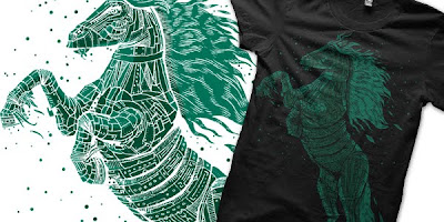
We all know what Sunday is, right? Of course we do! Which is why we're starting off this week with a freakin' spaceman in a business suit. SUPER AWESOME! Biotwist's Travelin' In My Spacesuit can.and.will destroy whatever pathetic lameness is in store for you this weekend. The colors are bright and spacey (and the negative space usage is brilliant), the motion is perfect, along with the powerful pose of powerful power. I like how this spices up the monotony of the average desk job in a way that anyone with said desk job would appreciate. Sadly, most o' them stiffs would never don an awesome tshirt. Suits are professional, and you never know when you need to network! For the rest of us that aren't totally boring, though, this piece, up for votes at Design by Humans, is plenty appealing and incredibly wearable.

Ok, fine. You want something sweeter. Well, Goodjoe is always a great place for something heartwarming. The premiere feel-good tee shop is having a sale throughout the month of February... $15 tees, free shipping on orders over $30, free MP3s, donating to the homeless... they're goin' crazy, so we definitely think now would be as good a time as any to give them some lovin'. And speakin' of lovin', who loves ya more than your family? Besides possibly Telly Savalas. So warm your heart with ansharp's charming tale of a family unlike any other. Because they're made of corn. The Corn Family comes with one simple flaw, to me: it needs less label. The illustration is too charming to really need them, and the strongest jokes here make themselves... the "pop" corn, the "baby" corn, the brilliant corn dog... c'mon, that dog alone makes this shirt worth a vote and probably a buy, right? The tee really owns its stylistic reference point... this definitely is distinguishable as a family portrait, but I love how arbitrary the family is. I mean, seriously, corn? It's definitely a different idea I haven't seen anywhere else. That could be for many reasons, but we all know I love the weird and wonderful, so I'm not going to complain, especially when the design is smartly done too: the small "baby" variety, the fresh cob as the son, the uber-processed, possibly stale chip grandfather, and a pet that isn't even technically the same species (corn dogs are delicious and meaty, despite their batter, after all). With just a little less text, this would be perfect.

Fine, fine, fine, family love is weirding you out in the context? Let's get some real romance on with Threadless, then. Will that make you happy? Fantasize about that perfect first date, finding someone who really seems to be just like you, and sharing a romantic dinner. It's perfect! Except when you find out he is potentially a cannibal. An Awkward Moment is a tee I can relate to all too well (but I don't share those stories with just anyone). Designed by how-is-this-dude-not-printed-yet Nathanwpyle at gmail.com (someone contact this dude and give him money for something or other. His name is his contact info! It's easy, Threadless!) the scene leaves a lot to the imagination. Is this dude a psychopath? Did a makeout session go horribly wrong? Why are people made of spaghetti? My guess is miss pastawoman spent too much time talking about babies, and pastaman got bored. Can't blame him. But yes, romance. Isn't it romantic? Not only that, but the design is illustrated very attractively yet simply, perfect to dampen what could border on gross-out humor into pure ridiculousness. This is Threadless to a T.

God, seriously? You're STILL not satisfied? It's just like a man-or-woman to never be happy with what they get. How about something pink. Pink's relevant, right? How about this shirt. It's got lots of pink. Ecsu is totally forging a path to your fickle little heart with Decay (We are all made of stars). No, no, it's not about decay as such. It's about how you're a star, my dear. And maybe a little about decay too. Consider the cascading repetition of the theme, the rebuilding and refleshing. It's stunning, especially the way every layer is styled differently... the realism of the skeletal arm at the top; the visceral, sinewy musculature, sprouting buildings throughout the arm; the angular, shattered, withered third iteration; and finally, the rigid sheath=, reflecting the universe from it. It's powerful imagery, skilled execution... and really like nothing else I've seen. It feels like a Threadless select, aesthetically. It pushes the envelope of what is accepted on a shirt, and it does so with a total minimalist palette to convey some serious detail and diversity. The textures and executions layer wonderfully and powerfully. It's hard to explain the appreciation of the piece without jumping around and getting disjointed because part of the power is in its own section-by-section layout. I have no clue what I'm saying any more. Suffice it to say this is awesome.


Yeah, I noticed that wasn't good enough for you. I shoulda known it wouldn't work when you weren't impressed by Spaceman in a Suit. But honestly, this is the best I can do. Any more, er, topical, and I'd... well, look at this shirt. It's Mind Effusion by Rameque. I talk about flow a lot in tees, and here's an example of that flow making a tee 100% more wearable in its own shape. The streams of things spewing from the character's hood lead the eye, and make the circular piece feel way less rigid than it could otherwise. The real selling point is the wonderful color scheme, though. There's lots to look at, and lots to follow. There's a striking image, powerful in its nearly haunting nature. Without killer colors, though, it could be lost. There are a lot of elements in this piece that, done differently, could have yielded a far less successful piece, but altogether, we have a unique and attractive and wearable final product. Now, my friends, it is late, and if I continue this ridiculous dialogue any longer, my face will flow out of my own head like this, but less awesome. Go vote.

Sunday, February 7, 2010

Superboots Sunday

I think there's some sort of big event going on today, but as far as I'm concerned, BootsBoots Sunday is more important. Not only is she the winning print at shirt.woot today, but Tilteed is bringing you a forgotten Boots classic. It's Mechanical Island, which we love for its whimsy. It's part Rube Goldberg, part bizarre creation myth, and part brilliant solution to our energy crisis. Yknow, if we hadn't overfished the oceans as well.
The colors are almost jeweled in a dulled, subtle way, but more important is the flow up the shirt, and the imaginative world the scene creates. I'm pretty excited to finally own this piece, personally, and I hope a bunch of you are excited about it also. Just remember, it's only on sale from now until Wednesday Noon. If you like it, then you should put a buy on it. If you're unsure, consider checking back after that other event. I'm sure you'll feel better about it by then.

Saturday, February 6, 2010

5tarting Anew

So, this week is the first week of yet another freakin' daily limited tee site. 5quidink is not about 5-quid ink (which I'm actually happy about, since it means avoiding ludicrous exchange rates and shipping times/costs), but it is about water based inks, which is pretty cool, and they change over at 2am, which fills a gap between the major site changeovers. This is pretty exciting for my nerdy self.

I generally believe daily sites are worth checking, well, daily, for better or worse, simply for the limitedness. 5quidink is no exception. Today, however, is a better-day-than-most to check it out, because there's a sweet randyotter design up for sale. Bull in a China Shop is a charming little piece. It hinges largely on knowing the origin of the saying, but also has plenty of personal illustrative charm. It's my first buy with them, which is a big thing for me on a site's first week, and it should maybe be yours too, but remember, as with anywhere like this, it is limited, so get it fast.

Thursday, February 4, 2010

Contest Watch: Week of January 28

Ahoy-hoy, tee-totallers! Welcome to another week of Contest Watch, Awesome Shirts, and apparently Horrible Puns. Before we kick off the meat of this episode, do check these past CW features: Radiomode has redone his Curiosity Kills design, and while I liked the much rougher, simple original better, fans might want to check it out at Tilteed anyway. Also, just off its Threadless hold, jstumpenhorst's Fawn in Headlights is trying its luck at Design by Humans, where it might just do better: DBH is a stronghold of pieces like this, even despite its everyday operations leaning more toward the watercolor wolf variety.

We'll start the official watch at Design by Humans as well, with a piece I probably shoulda brought in last week, but with Hallmark beating down our doors, I think Forsaking All Others might be a brilliant piece to realize that there is never an excuse for schmaltz, unless you're cooking with chicken fat. Jewelwing takes the multifaceted approach: Love is Like an Anchor. Personally, I would complete the maxim with something about pointless weight drowning us, but the designer judiciously gives a number of interpretations, not all of which are cynical. The style is strong enough to support any of them: clean, almost tattoo-inspired vectors make this look totally at home in the DBH catalog, while the palette works for its stark contrast as well as its simplicity (there's no generic reds to symbolize love, nor blues to take the ocean theme to its tired conclusion). It's all about solid linework creating a design full of motion and power, focusing on the anchor's weighty, steadfast nature, not the oft-cliched images of romance.

Were DBH to select the last piece, it'd fit their site perfectly, but over at Threadless, it's the last week of their search for the brand new trend of 2010. Some people have suggested that simple is coming back. Others think it's about time for pushing themselves to create brilliant, original work. Still others want to see hand-drawing make a comeback. And some people are lazy and greedy and think 5 minutes appropriating someone else's now-public-domain imagery is worthy of 2 grand (and I must say, if this did occur, I'd revel in starting a site that basically printed the same tee. It's not stealing if it was never theirs to begin with, right? FAIR USE!) I fully expect to see one of a few photo-puns take the prize, but it's not keeping me from throwing print-support behind Sanguine Parliament. Thunderpeel, the designer, discusses figure/ground relationships and the like in his explanation, but when it comes right down to it, I'm for it simply for being a trend of awesomeness. The colors here are incredibold, and a little delicious (who isn't honestly thinking of ice cream or taffy right now?) and the size comes up and pecks your eyes out. The owls are composed in a lovely cartoonist style, staring us down fiercely and forming a wolf, which is echoed in the clouds. The motifs and flow are all stunning, and my eyes cannot stop gawking at this. The oddity here seems to make sense due to the design's intensity... it's so well planned that you don't ask why or what, you just marvel and drool. Or I marvel and drool. There isn't another tee like this out there that I've seen, and that is 100x reason enough that it must exist: it informs just how diverse t-shirt art can be (because again, this is legitimately art, not just clothing).

From shirt-as-art to art-on-shirt, The Lost Adventures of Captain Nemo is no less effective a piece. Pakpandir doesn't explain what the new trend is, but it should be freaking awesomeness with limited palettes: the design gives us an epic battle, all in four smartly chosen colors. I'll admit, I can be a sucker for a smartly done sea-critter piece, but even without the obvious pun potential here, the design had me at Giant Nautilus. Under-rated creature of the deep that it is, I'm loving the unique beauty of the shelled cephalopod getting to take center stage in this piece. It's stunningly illustrated and colored, and the waves froth splendidly as the rickety little steampunk sub is pretty much owned by it, creating some lovely motion and filling the tee nicely. A definite buy if Threadless knows the score enough to get this printed.

The last new trend of the year, at least as our blog is concerned, is art for art's sake, or "stuff and that," as sweet n sour asserts. His design Semper Idem certainly makes good on "stuffness" and "thatitude," too... the piece revels in artistry without bothering to have an easily discernible point, unless one wishes to believe the point is "awesome designs must exist." And with flames and cacti or possibly antlers coming out of women lost in huge beefeater helmets, or clouds and rainbows spilling out of chutes and into smaller containers, or the lovely doodle accents around the entire main piece, this certainly is awesome (not to mention an excellent use of purple). When I look through Threadless' back catalog, I see lots of work that revels in this aesthetic of stunning, thought-provoking, unique art, and I see no reason why ten years lateer, the site can't do a bit more than pay lip-service to the most creative, hardest working, most unique designers and pieces in its stable. The piece here represents what I'd love to see most this year at Threadless... a return to printing more of what is special and attractive, and maybe easing off the puns. Weekly alumni picks would be stellar. Another year of awesome April Fools tees would be perfect. Reprints of tees people haven't been able to get for years instead of the same handful of regular sellers would be phenomenal. And all of that is summed up for me looking at this piece. It could herald a new dawn of Threadless... when you're number one, the most dangerous thing to do is to get complacent and stop innovating. A Threadless where great, creative art is the number one priority could do huge things for the entire tee world.


Ending an unintentionally simple-colored week is the simplest of all: thatrobert's "The Heart is Deceitful Above All Things." With a shirt.woot theme as awful as "heart," this nearly-blatantly-obvious piece stood out because it really was a perfect, simple tee graphic. It's crisp. It's instantly understandable. It's a little subversive while being a lot adorable (and somehow appealingly so... the vacant faces make them all the more unsettling, I think). It could even be iconic. There's just enough concept, just enough size, just enough color to make everything work, and it looks incredibly hot on heather gray, reason enough for praise. I love my artistic tees, and find the bias against them ludicrous, but t-shirts were a born canvas for simpler work like this. If only all simple work took the time to be effective as well, instead of just simple clothes for simple people: the world would be a better (and less hideously ugly) place.

Snoreassic Park


I'm pretty much stoked to be stating that Tilteed will be printing Dekonstruct's Brontosnorus Saves the World this weekend. The popular past woot derby piece and former Contest Watch favorite will be on sale until Sunday, Noon Pacific, so for all y'all who were crushed when this didn't print at woot, put your money where your mouth is and pick a copy up. It'll totally be worth it: Tilteed's prints are awesome, and so is Dekon's design. The humor of the dino dream and the stark black-on-white make for a piece which is both fun and hip at the same time.

We're big on the idea of this piece doing well, but if you're more interested in printing with us instead of buying with us, feel free to contact me at Adder (at) Tilteed (dot) com. For the rest of you, be sure to keep your head up: Tilteed Limited is indeed a limited time offer, so grab one now so you don't miss it later.