FOR ONE DAY ONLY:
~THE APPARITION OF THE GROUCHY GOD is on sale at Teefury for $9!
FOR ONE MORE DAY:
~BlakeB and RobbieLee at Teextile for $15!
YOU HAVE BEEN FOREWARNED
Saturday, May 30, 2009
Friday, May 29, 2009
SuperSecret Teefury Preview (ON SALE SUNDAY!!!)
 While I feel obligated to remind you that you can and should pick up Trash by RobbieLee at Teextile today for $12, I have much bigger news.
See, I was leaked an exclusive sneak peek at Sunday's TeeFury, and I would be remiss if I did not share it with you. It's a HUGELY exciting one for me, to be honest, so I've been absolutely bubbling trying to keep it in, but I can finally tell you: THIS SUNDAY, MAY 31st, TeeFury is printing Apparition of the Grouchy God, by Aphte. And it will be glorious.
Apparition looks a little different from how we last saw it, long long ago in one of our earliest Contest Watch segments (shame they couldn't have printed it right to the seam like they did for Pseudo's Daughter), but there's still so much to love: the many-eyed god is still there, the whimsical town is still 100% charming, and the vomiting is still the most awesome vomit ever. The color scheme is still bold, with the blue and pink against the silver blank, and still makes the piece look like a candy-or-fondant-world. Which I'm all for. And there's still plenty to see here... great detail and plenty of eye candy upon repeat views. Aphte says his inspiration was largely this: "Let's do something quite complex, but there should be also a huge monster or something like that." And really, who can argue with that logic?
If you think this tee is as awesome as I do (and ye gods, it is pretty damn awesome), you've got a little bit of time to make sure you'll be around long enough to order one of these fine specimens on Sunday. Just remember, with TeeFury, you get 24 hours. A full 24 hours, but ONLY 24 hours. Be sure to plan accordingly, because this shirt is too good to miss, and if you miss it, you miss it fo' sho'. I'll be sure to remind you on Sunday. Loudly.
The expected mock-up is below... I'm leaving both images as-is, so you can get the full-size experience. Past that, I'll leave you with some further wisdom from Aphte:
While drawing this, I was thinking of a little story to be associated with it. The big monster would become the God of a big city, and he was kind of pissed off by all these creatures praying for him so he attacked the city without another real reason. Because this God's got an IQ of 27. Well. Something like that, I guess.

Thursday, May 28, 2009
Contest Watch: Week of May 21
Good day, voteshine. Herein we once again speak of five thusfar unprinted yet totally worthy pieces from the contestsphere. Firstly, however, one should note the meteoric rise of BootsBoots' wonderful "Cheer Up, She Found You" at Cameesa. If you can catch it before it's fully funded, definitely do so.
 Another reminder is that BlakeB's "Amongst the Trees" is on sale for $12 today at Teextile. If you miss that one, you can always get it for $15 this weekend, but money saved is money earned, they say. And say, while you're there, why not toss a vote toward Wotto's "The Dark Side of Doodles". Admittedly, I don't know where the "Dark Side" comes in... these guys are among the most charming and good-natured doodles I've seen, but they ARE done predominantly in stark black, so perhaps it's a shade issue alone. The "creatures on a shirt" tee is pretty done, but the characters can always save one from the abyss of similar pieces. I'm totally digging Aardvark Man, Sassy Pill, and Bendy Cactus, among many others. Other elements that take this to the next level: a definite, distinct flow (as opposed to just piling all sorts of crap onto a tee), and a classic, stark palette that frequent readers would know I'm a sucker for.
 Threadless would like you to remember some important human truths this week: Everybody Needs Somebody sometimes. Everybody needs a shirt somehow. And something in PencilPlusPaper's design just told me my sometime is now. There is just too much charming going on here to deny. Sure, the title sequence at the bottom of the importance of companionship is nice and all, but I'm liking the style of the barrage of bolts coming down upon them even better. I am especially enthralled with the characterization of the clouds. They are adorable, yet their blank eyes make them look just malicious enough to keep hurtling electric doom down at the pair below. Overall, this is a great argument for the importance of a good style, but I also quite approve of the placement. The bottom landscape spreading out across the shirt helps give body to the design, anchoring it so it's not just a slim stripe of art down the center, but that streamlining of the main art makes this an excellent all-weather tee, insofar that you can layer it with ease, and still have the full piece show through the overshirt. For someone who wears tees in winter like myself, this can sometimes increase the appeal. But really, I think this tee will be appealing just on its own. A definite buy.
 When shirt.woot actually has a strong fog with a weak theme, finding a must-mention can be hard, so "thankfully" that happens rarely. Even so, ilovedoodle's "May I?" shows how cute SHOULD be done. At all times. It should be charming and it should be creative and it should inhabit a shirt well. I appreciate the shadowy dancing pairs in the background helping to anchor the two main characters and give context (something so many cute purveyors neglect in favor of just ratcheting up the adorable). Not that the Threadless mainstay doesn't have plenty of "aww" in his entry... while gender is ignored wholesale, the idea of two of the world's flashiest birds at a fancy dress ball is a great one, with the proper penguin extending his hand to what we will generously call a female peacock. Really, the fancy princess look goes perfectly with the bird. It's a straightforward visual joke with the sort of crisp cartooning that best suits this sort of idea... it's nice to see another pro slogging it out in the derby to show us how this stuff is done right.
 Quite the opposite of cute, aksel is putting the fear of God and Fish into Threadless with A Ladder to Heaven. It is uncertain to me thusfar whether the piece is a commentary or simply a juxtaposition, but either way it is brilliant. As a juxtaposition, it imagines what a predator might use to lure humans. With fish, it is light, but for us, it might be that light at the end of the tunnel... the idea of final, pure happiness. Like fish, we'd head toward the presumed light. As a commentary, though, it shines doubly, implying that blind faith can be little more than a deadly trap, and that we need to analyze what we're doing before we go climbing that ladder. Even without the two possible purposes, though, the piece is, er, luminescent. The colors work well, contrasting well with each other... the shirt blank gives a feeling of both duskiness as well as being underwater, and the golden ladder and gates pop off the tee (especially with the implied foil suggestion). The size and placement are also noteworthy, really dominating the shirt and making sure it makes a statement. A really original piece that deserves some recognition.
 And then, speaking of originality, there is this thing from Design by Humans: Prehisteria, by Weaselfarm. I don't understand it. I don't know why I like it. But the black linework on the white tee certainly can't hurt. The visceral look of the two prehistoric creatures is definitely appealing. And the arbitrary transparencies not only make this visually enticing, but are done in a palette that is both different yet not clashing. It's a weird piece, but I think that's precisely the main attraction.
Another reminder is that BlakeB's "Amongst the Trees" is on sale for $12 today at Teextile. If you miss that one, you can always get it for $15 this weekend, but money saved is money earned, they say. And say, while you're there, why not toss a vote toward Wotto's "The Dark Side of Doodles". Admittedly, I don't know where the "Dark Side" comes in... these guys are among the most charming and good-natured doodles I've seen, but they ARE done predominantly in stark black, so perhaps it's a shade issue alone. The "creatures on a shirt" tee is pretty done, but the characters can always save one from the abyss of similar pieces. I'm totally digging Aardvark Man, Sassy Pill, and Bendy Cactus, among many others. Other elements that take this to the next level: a definite, distinct flow (as opposed to just piling all sorts of crap onto a tee), and a classic, stark palette that frequent readers would know I'm a sucker for.Threadless would like you to remember some important human truths this week: Everybody Needs Somebody sometimes. Everybody needs a shirt somehow. And something in PencilPlusPaper's design just told me my sometime is now. There is just too much charming going on here to deny. Sure, the title sequence at the bottom of the importance of companionship is nice and all, but I'm liking the style of the barrage of bolts coming down upon them even better. I am especially enthralled with the characterization of the clouds. They are adorable, yet their blank eyes make them look just malicious enough to keep hurtling electric doom down at the pair below. Overall, this is a great argument for the importance of a good style, but I also quite approve of the placement. The bottom landscape spreading out across the shirt helps give body to the design, anchoring it so it's not just a slim stripe of art down the center, but that streamlining of the main art makes this an excellent all-weather tee, insofar that you can layer it with ease, and still have the full piece show through the overshirt. For someone who wears tees in winter like myself, this can sometimes increase the appeal. But really, I think this tee will be appealing just on its own. A definite buy.When shirt.woot actually has a strong fog with a weak theme, finding a must-mention can be hard, so "thankfully" that happens rarely. Even so, ilovedoodle's "May I?" shows how cute SHOULD be done. At all times. It should be charming and it should be creative and it should inhabit a shirt well. I appreciate the shadowy dancing pairs in the background helping to anchor the two main characters and give context (something so many cute purveyors neglect in favor of just ratcheting up the adorable). Not that the Threadless mainstay doesn't have plenty of "aww" in his entry... while gender is ignored wholesale, the idea of two of the world's flashiest birds at a fancy dress ball is a great one, with the proper penguin extending his hand to what we will generously call a female peacock. Really, the fancy princess look goes perfectly with the bird. It's a straightforward visual joke with the sort of crisp cartooning that best suits this sort of idea... it's nice to see another pro slogging it out in the derby to show us how this stuff is done right.Quite the opposite of cute, aksel is putting the fear of God and Fish into Threadless with A Ladder to Heaven. It is uncertain to me thusfar whether the piece is a commentary or simply a juxtaposition, but either way it is brilliant. As a juxtaposition, it imagines what a predator might use to lure humans. With fish, it is light, but for us, it might be that light at the end of the tunnel... the idea of final, pure happiness. Like fish, we'd head toward the presumed light. As a commentary, though, it shines doubly, implying that blind faith can be little more than a deadly trap, and that we need to analyze what we're doing before we go climbing that ladder. Even without the two possible purposes, though, the piece is, er, luminescent. The colors work well, contrasting well with each other... the shirt blank gives a feeling of both duskiness as well as being underwater, and the golden ladder and gates pop off the tee (especially with the implied foil suggestion). The size and placement are also noteworthy, really dominating the shirt and making sure it makes a statement. A really original piece that deserves some recognition.And then, speaking of originality, there is this thing from Design by Humans: Prehisteria, by Weaselfarm. I don't understand it. I don't know why I like it. But the black linework on the white tee certainly can't hurt. The visceral look of the two prehistoric creatures is definitely appealing. And the arbitrary transparencies not only make this visually enticing, but are done in a palette that is both different yet not clashing. It's a weird piece, but I think that's precisely the main attraction.
Tuesday, May 26, 2009
A Series of Fortunate Events
It has been a while since I last talked about Teextile. I guess technically, after the long weekend, it's been a while since I discussed anything, but Teextile has borne a definite lack of mention since my favorable tee review about a month ago (pro-tip: my second teex-tee, while not as wonderfully soft in its print as I Want To Dance, was still wonderfully done). But this week is different. Because this week is probably the best series they've put out since opening.
 The highlight is BlakeB's monotone masterpiece Amongst the Trees, which is on sale now but will be featured Thursday for $12. The grammar nerd in me cannot help but remember a former English teacher going on a diatribe about the word "amongst," how it was an archaic form that died and never needed to be brought back by Mike Myers... but the title is never more important than the tee itself, and the tee itself is wonderful. I love the individual and differing patterns on the bevy of trees in the piece, which keeps the art from fully blurring into itself, but still creates a camouflage for the huge hominid making his way through them. While the piece could easily have made its way a bit higher up the chest, I still like how it climbs up from the bottom and leaves an ample skyline along the chest. Finally, there is a certain everyman charm to the execution... it is skillful, but imperfect, making it something anyone can relate to artistically. More than anything, though, it's conceptual, both with the sheer joy of pattern as well as the fantasy that the reason we don't see more bigfoot-esque critters is because they simply hide too well.
 There are two other pieces worthy of note, of course, as well... first being Smoking's long awaited Whale of a Bath Time, a sub that revels in watercolors. It's today's feature, for the next few hours, and one that has been well scored and revised at Threadless a number of times to much excitement and no eventual print. Fans should remember to pick one up this week while they can. But then, there's also robbielee's Trash, which has also made its way around the contest circuits over the last year. It's a fun take on recycling that makes you feel a bit guilty for your cast-out landfill fodder. Prime stuff for the environmental minded, or just fans of a good humor tee. It'll be featured Friday, but as all Teextile shirts, it'll be up all week. With a piece from the popular Olechka and an actually intriguing DBH-style print from argie rounding out the week, it's easy to see what would keep someone like me excited about this series. And no, it's not just my as-late blind devotion to white blanks. I have more depth to me than that!
If you plan on purchasing, btw, feel free to let them know AdderXYU sent ya'... it's always appreciated.
The highlight is BlakeB's monotone masterpiece Amongst the Trees, which is on sale now but will be featured Thursday for $12. The grammar nerd in me cannot help but remember a former English teacher going on a diatribe about the word "amongst," how it was an archaic form that died and never needed to be brought back by Mike Myers... but the title is never more important than the tee itself, and the tee itself is wonderful. I love the individual and differing patterns on the bevy of trees in the piece, which keeps the art from fully blurring into itself, but still creates a camouflage for the huge hominid making his way through them. While the piece could easily have made its way a bit higher up the chest, I still like how it climbs up from the bottom and leaves an ample skyline along the chest. Finally, there is a certain everyman charm to the execution... it is skillful, but imperfect, making it something anyone can relate to artistically. More than anything, though, it's conceptual, both with the sheer joy of pattern as well as the fantasy that the reason we don't see more bigfoot-esque critters is because they simply hide too well.There are two other pieces worthy of note, of course, as well... first being Smoking's long awaited Whale of a Bath Time, a sub that revels in watercolors. It's today's feature, for the next few hours, and one that has been well scored and revised at Threadless a number of times to much excitement and no eventual print. Fans should remember to pick one up this week while they can. But then, there's also robbielee's Trash, which has also made its way around the contest circuits over the last year. It's a fun take on recycling that makes you feel a bit guilty for your cast-out landfill fodder. Prime stuff for the environmental minded, or just fans of a good humor tee. It'll be featured Friday, but as all Teextile shirts, it'll be up all week. With a piece from the popular Olechka and an actually intriguing DBH-style print from argie rounding out the week, it's easy to see what would keep someone like me excited about this series. And no, it's not just my as-late blind devotion to white blanks. I have more depth to me than that!If you plan on purchasing, btw, feel free to let them know AdderXYU sent ya'... it's always appreciated.
Friday, May 22, 2009
Seibei Summer Clearance!
 So it's just like me to hear about things late, but as they say, better late than never, especially for this tidbit. Seibei, dino-and-monster purveyor extraordinaire, is going to be discontinuing a metric ton of shirts on June 2. That's comin' up around the bend, so if you're jonesing for some Seibei swag, now is a good time to make sure you don't miss out.
The full list of to-be-discontinued items can be found in the Seibei Blog, but for my money, the best of the tees to be lost to time is the mint pressing of Superpredators. It's a big bold print on a color that just doesn't get much love these days, which is enough to make it stand out. That it features one of Seibei's most iconic creations is just icing on the cake... the dino is more menacing, yet no less charming, blown up huge on the shirt, and having just gotten my Taco Dino in the mail, I can vouch that this will look totally awesome live and in person. This design will be back in new colorways, but if you're like me and are cautious of such changes, now is the time to put this guy in your closet.
If you're quick, you might be able to catch the very tail end of an extra promotion: code GOODBYE will snag you 25% off all orders 'til tomorrow. If you miss out, however, don't forget that code SINGULARITEE will always save you 10% at Seibei.
Thursday, May 21, 2009
Contest Watch: Week of May 14
We here at Singularitee hope you've been enjoying what, at least around here, has been a wholly lovely week. I have as well, which is part of why tonight might seem a bit hasty. Here, then, are your Contest Watch selections for the week. Enjoy!
 Shirt: Some Sort of Avalanche. Artist: Samanpwbb. Site: Design by Humans. If there's one thing I wish more people would stop doing, it's mocking their entries on weathered backgrounds, making it look like a fresco or parchment. I say this because inevitably, the shirt itself looks less awesome than the detail view. This particular piece, however, still looks great on white. The design is the sort of abstract, artistic piece that DBH is at its best while printing... the flow is attractive, the colors earthy and classy, and the concept is up in the air. To me, the piece implies that the titular avalanche is a mess of things blindsiding the character here, or else the stumbling figure is succumbing to a confusion, with the icons symbolizing that daze, but the vagueness is such that plenty of people can find their own connection (not to mention simply looking stellar). But yeah, that parchment look at the side makes me wish it was getting an appropriate print as well, as it would look smashing on my wall.
 Shirt: Nautical Problem. Designer: Buko. Site: Threadless. Sometimes shirts end voting just before I get a CW segment up. This is one of those times. So while I already know Buko got another very well deserved mega-score, I cannot go without saying more. The designer is one who seems simply unable to do mediocre work (something this world needs more of), but everything is so perfectly marketable, as well. This design is proof positive of that gift. The concept dwells in the world of creativity, imagining a bird so large it would dine on submarines, but the execution is really what sells it. The linework and detail are gorgeous, and the motion, both of the bird and the water as it dives, are executed brilliantly in a blur of turbulence. Even the watercolors stun, both due to the bold colors and the way they accentuate that very motion... using that technique to color the piece really sells the "splash" as the immense protagonist closes in on its submerged prey. Between the score, the comments, and the sheer greatness of the art, I cannot imagine this not finding its way to print.
 Shirt: Elephant in the Sitting Room. Artist: Krakaboom. Site: Threadless. This piece is far less about wowing with art than wowing with concept, but it does both. The art is perfect in its simplicity, with the capable, charming line drawings of the various inhabitants of the room, and the big, bold, pink elephant trying to blend in. The concept utilizes UV ink, so indoors, the elephant would be invisible, but undeniable in the sunlight. The concept plays off the idea of the awkward silence... when something huge is hanging over the mood, and everyone knows it's there, but doesn't want to acknowledge the "elephant in the room". Using the UV ink is brilliant for the concept, as is the elephant's "transparent" placement, with all the inhabitants showing up in front of its mass. Both elements make the elephant seem all the more ignored and seemingly invisible. Most importantly for a hidden ink concept, though, the tee is totally wearable in either setting. And I look forward to wearing it in both.
 Shirt: Octo System. Artist: theinfinityloop. Site: Shirt.woot. Woot's selections have a lot to do with Threadless's, though not intentionally so. Like Buko's, the first one touches on the wonders of the deep, but while his brings a denizen of the air down under the waves to cause havoc, this one takes an octopus and brings it out into space to do the same. Also tying the two together: use of style. It was expected (though not at all enforced) that designs would need to be created via pointillism, the theme this week, and this was certainly among the purest uses of the theme... one more style the designer can do well, and one more reason her work continues to impress me. The style works well with the astronomic subject matter, giving the piece a wispy, impressionist feel that evokes some of the more interesting outer space phenomena. Not to mention I'm always a fan of a good octo shirt, especially with the both warm-and-cool palette used here.
 Shirt: Salt and Pepper. Artist: Radscoolian. Site: Shirt.woot. You'll note the similarities more in this one: huge, leather-skinned mammals are the main focus of both. I thought this was one of the most creative designs I've seen at woot in a LONG time, using the theme as a subject. I'll be honest, I don't know how a rhino relates to salt or pepper, but the elements created a totally unique piece that, while more stippling than pure pointillism, looked great and gave a reason for the style. I was totally rooting for it when it hit the fog. Which brings up the other similarity between the two pachyderms: in both tees, there's an elephant in the room. Woot's is less readily obvious: this piece ended up rejected for its vectored shakers, regardless of the bulk of the work being created via points. Which would be tolerable, if pieces that included smooth, vectored underlayers (and long lines as opposed to dots or daubs) were considered "in the spirit" of the theme. I generally caution new-to-woot designers against submitting unless they're able to deal with uninformed ridicule, fickle moderation, and watching the most inferior work trump their own. I add yet another qualifier after this week: if you care at all about a site that plays fair, the derby is not for you. Woot itself might not be right for you. The customers, many of the designers, and now even the staff don't care about the rules to the contest. If you take pride in your work, or in putting in the effort to meet your client's specifications, I recommend taking a moment to reflect before considering making woot your client.
Sorry to get political, but to me, in the world of art, it is artistry that needs to go rewarded. You'd get outraged if the least qualified brown-nosers were always getting the bonuses at your day job. You'd get disgusted if you worked your tail off for your boss, and saw more popular employees with no work ethic get praised and rewarded. It should be no different in art: anything less devalues the entire concept of artistry. Part of the reason I started blogging was to feature work that is deserving of notice and praise: to show off how great shirt design can be, and to try and attach designs to a market that might not have noticed them before. Because true art isn't what goes out to sell to a market... it's what exists and hopes someday the right market comes. Most of us who have gotten deep into any art know what it's like to find those perfect pieces... regardless of what mainstream appreciation we may have, we all have the author none of our friends know, or the band we stumbled on in the dollar bin, or the artist we saw at a local exhibit and were drawn to... we love our preferred arts for those rarities, not for the easy sales. And if you read this blog, I believe you believe that a shirt can be a shirt, but it can be much more as well. I think there's no time like the present to ask ourselves, as appreciators and designers, where we stand on art. Because as time goes on, the more I feel that it is the money, not pride or respect or accomplishment or sheer joy of creation, that keeps the modern art community going. And I see no better time than now to start the resistance in earnest.
Thank you for your time. SingulariTee will return you to your regularly scheduled programming this weekend.
Shirt: Some Sort of Avalanche. Artist: Samanpwbb. Site: Design by Humans. If there's one thing I wish more people would stop doing, it's mocking their entries on weathered backgrounds, making it look like a fresco or parchment. I say this because inevitably, the shirt itself looks less awesome than the detail view. This particular piece, however, still looks great on white. The design is the sort of abstract, artistic piece that DBH is at its best while printing... the flow is attractive, the colors earthy and classy, and the concept is up in the air. To me, the piece implies that the titular avalanche is a mess of things blindsiding the character here, or else the stumbling figure is succumbing to a confusion, with the icons symbolizing that daze, but the vagueness is such that plenty of people can find their own connection (not to mention simply looking stellar). But yeah, that parchment look at the side makes me wish it was getting an appropriate print as well, as it would look smashing on my wall.Shirt: Nautical Problem. Designer: Buko. Site: Threadless. Sometimes shirts end voting just before I get a CW segment up. This is one of those times. So while I already know Buko got another very well deserved mega-score, I cannot go without saying more. The designer is one who seems simply unable to do mediocre work (something this world needs more of), but everything is so perfectly marketable, as well. This design is proof positive of that gift. The concept dwells in the world of creativity, imagining a bird so large it would dine on submarines, but the execution is really what sells it. The linework and detail are gorgeous, and the motion, both of the bird and the water as it dives, are executed brilliantly in a blur of turbulence. Even the watercolors stun, both due to the bold colors and the way they accentuate that very motion... using that technique to color the piece really sells the "splash" as the immense protagonist closes in on its submerged prey. Between the score, the comments, and the sheer greatness of the art, I cannot imagine this not finding its way to print.Shirt: Elephant in the Sitting Room. Artist: Krakaboom. Site: Threadless. This piece is far less about wowing with art than wowing with concept, but it does both. The art is perfect in its simplicity, with the capable, charming line drawings of the various inhabitants of the room, and the big, bold, pink elephant trying to blend in. The concept utilizes UV ink, so indoors, the elephant would be invisible, but undeniable in the sunlight. The concept plays off the idea of the awkward silence... when something huge is hanging over the mood, and everyone knows it's there, but doesn't want to acknowledge the "elephant in the room". Using the UV ink is brilliant for the concept, as is the elephant's "transparent" placement, with all the inhabitants showing up in front of its mass. Both elements make the elephant seem all the more ignored and seemingly invisible. Most importantly for a hidden ink concept, though, the tee is totally wearable in either setting. And I look forward to wearing it in both.Shirt: Octo System. Artist: theinfinityloop. Site: Shirt.woot. Woot's selections have a lot to do with Threadless's, though not intentionally so. Like Buko's, the first one touches on the wonders of the deep, but while his brings a denizen of the air down under the waves to cause havoc, this one takes an octopus and brings it out into space to do the same. Also tying the two together: use of style. It was expected (though not at all enforced) that designs would need to be created via pointillism, the theme this week, and this was certainly among the purest uses of the theme... one more style the designer can do well, and one more reason her work continues to impress me. The style works well with the astronomic subject matter, giving the piece a wispy, impressionist feel that evokes some of the more interesting outer space phenomena. Not to mention I'm always a fan of a good octo shirt, especially with the both warm-and-cool palette used here.Shirt: Salt and Pepper. Artist: Radscoolian. Site: Shirt.woot. You'll note the similarities more in this one: huge, leather-skinned mammals are the main focus of both. I thought this was one of the most creative designs I've seen at woot in a LONG time, using the theme as a subject. I'll be honest, I don't know how a rhino relates to salt or pepper, but the elements created a totally unique piece that, while more stippling than pure pointillism, looked great and gave a reason for the style. I was totally rooting for it when it hit the fog. Which brings up the other similarity between the two pachyderms: in both tees, there's an elephant in the room. Woot's is less readily obvious: this piece ended up rejected for its vectored shakers, regardless of the bulk of the work being created via points. Which would be tolerable, if pieces that included smooth, vectored underlayers (and long lines as opposed to dots or daubs) were considered "in the spirit" of the theme. I generally caution new-to-woot designers against submitting unless they're able to deal with uninformed ridicule, fickle moderation, and watching the most inferior work trump their own. I add yet another qualifier after this week: if you care at all about a site that plays fair, the derby is not for you. Woot itself might not be right for you. The customers, many of the designers, and now even the staff don't care about the rules to the contest. If you take pride in your work, or in putting in the effort to meet your client's specifications, I recommend taking a moment to reflect before considering making woot your client.Sorry to get political, but to me, in the world of art, it is artistry that needs to go rewarded. You'd get outraged if the least qualified brown-nosers were always getting the bonuses at your day job. You'd get disgusted if you worked your tail off for your boss, and saw more popular employees with no work ethic get praised and rewarded. It should be no different in art: anything less devalues the entire concept of artistry. Part of the reason I started blogging was to feature work that is deserving of notice and praise: to show off how great shirt design can be, and to try and attach designs to a market that might not have noticed them before. Because true art isn't what goes out to sell to a market... it's what exists and hopes someday the right market comes. Most of us who have gotten deep into any art know what it's like to find those perfect pieces... regardless of what mainstream appreciation we may have, we all have the author none of our friends know, or the band we stumbled on in the dollar bin, or the artist we saw at a local exhibit and were drawn to... we love our preferred arts for those rarities, not for the easy sales. And if you read this blog, I believe you believe that a shirt can be a shirt, but it can be much more as well. I think there's no time like the present to ask ourselves, as appreciators and designers, where we stand on art. Because as time goes on, the more I feel that it is the money, not pride or respect or accomplishment or sheer joy of creation, that keeps the modern art community going. And I see no better time than now to start the resistance in earnest.
Thank you for your time. SingulariTee will return you to your regularly scheduled programming this weekend.
Wednesday, May 20, 2009
Uneetee Memorial Day Sale
 Summer fast approaches, and for many of us, regardless of solstices and equinoxes and what might be official, nothing heralds the sunny season in America quite like Memorial Day weekend. With barbecues, fairs, and all sorts of other outdoor gatherings, the long weekend is a great time to get casual and relish the languid atmosphere of the coming months.
It's also a perfect time to finally pull out the t-shirt reserves from winter storage, and Uneetee knows it. As such, they've got a coupon code out there, in case you need a few new ones: from now until May 31, you can save 15% on all catalog purchases with code SVMD15. While this (quite sadly) doesn't apply to their discounted new tees, nor to their daily "Insanitee" deals, it's a nice incentive to browse the back catalog, especially their oft-ignored hoodie section (hey, might as well stock up now, right?) Head far enough back, and you'll find Budi Satria Kwan's "Stardust," which shows a cowboy trying to wrest the stars from an impressionist sky. The style is of course nothing to sneeze at, while the concept itself has an imaginative whimsy that made it the first tee I truly felt I "needed" at Uneetee. The rope adds a great contrast to the main color scheme, and my eye is inevitably drawn to it. But possibly the big selling point for this was being Forest Green. It's a lovely shade in person, and one I would be happy to see more of on sale.
Monday, May 18, 2009
Into the Sun
 I score a lot of designs. Pretty much all of them at Threadless. I write about a lot of them, also. So it's rare these days for a shirt to come to print that I haven't seen and voted on. Things being as they are, it always pleases me when a piece I am not as familiar with comes through the pipeline, especially one I'd want to buy.
This week Threadless has given us one such piece: Icarus, by ISABOA. Another in the current $20 oversized-print series, I cannot imagine believing it to not be worth every cent. It's just incredibly striking. The placement is unconventional, in that the focus is to the side but the normal "chest print" area is still printed on, helping bring the eye in. The detail is stunning, with the modern day steampunk aviator taking the place of the protagonist in the classic Greek myth. The color is bold... a huge yellow circle provides the backdrop for the plummeting flyer and ties the image into the shirt. It's a brilliant piece, and it makes me wonder how it didn't catch my eye immediately. I don't expect it to last too long, so place your orders now, folks.
Friday, May 15, 2009
Marathon shirts
The sun is just starting to go down in my part of the world. I've got some tunes on, and a nice cold beer by my side. The beginning of the cool evening is streaming in through the window by my computer. Julia Sonmi Heglund has been announced as joining the TeeFury curating team. Life is good, my friends. Life is good. Unless your name is Jublin.
I guess technically Jublin's name isn't Jublin either. And it's not that his life is BAD necessarily. But he -is- training for a marathon, which I don't recommend. Why do you care? Well, for starters, he's a multi-printed shirt designer. Also, he's turning his personal marathon experience into a charity run. To sweeten the pot, he's running a contest for anyone who donates: you could win $100 to Threadless or DBH, or a pack of prints and art from him. Want to sponsor him? Check out the details! All donations will benefit Direct Relief International... Jublin recommends Charity Navigator if you'd like to learn more about this or any charity.
 We of the "sitting back with aforementioned cold one" persuasion feel it might be worth suggesting you donate to the "God Bless Jublin's Broken Body" fund as well, by buying some of the man's work. It shouldn't be hard to find an awesome Jublin tee, but if you want something bright and summery, consider Game Over, on presale now at Fuzzy Ink. For me, referential tees have gotten old, which is part of why I appreciate how the familiar characters on this one have gotten old, too. That's what makes this so fresh... while some nostalgia pieces don't go anywhere but tapping a familiar concept, this really goes whole hog into its parody. The idea of the whole cast of Mario still being together in old age is a great one in part because of how classic and enduring the franchise has been, but more so, it's great how much unique humor is in this piece. I love that second player Luigi is relegated to a peaceful wheelchair, unneeded as he usually is. I love how shuffleboarding Mario looks like the craziest old dude in the world in his raccoon suit. I cannot get enough of the piranha plant hijinks in the background. There's so much extra character infused in the familiar faces that it makes the piece something special, instead of a generic tribute. Get yours now, and be the hippest gamer on your block this summer!
I'll be putting down my $5-er this weekend (it only takes $5 for an entry... $15+ will get you two). If you want to wait, but think you might forget, there will be a banner link up this weekend as well. It's a great way to help out a worthy cause and have a chance for some sweet prizes, as well.
I guess technically Jublin's name isn't Jublin either. And it's not that his life is BAD necessarily. But he -is- training for a marathon, which I don't recommend. Why do you care? Well, for starters, he's a multi-printed shirt designer. Also, he's turning his personal marathon experience into a charity run. To sweeten the pot, he's running a contest for anyone who donates: you could win $100 to Threadless or DBH, or a pack of prints and art from him. Want to sponsor him? Check out the details! All donations will benefit Direct Relief International... Jublin recommends Charity Navigator if you'd like to learn more about this or any charity.
We of the "sitting back with aforementioned cold one" persuasion feel it might be worth suggesting you donate to the "God Bless Jublin's Broken Body" fund as well, by buying some of the man's work. It shouldn't be hard to find an awesome Jublin tee, but if you want something bright and summery, consider Game Over, on presale now at Fuzzy Ink. For me, referential tees have gotten old, which is part of why I appreciate how the familiar characters on this one have gotten old, too. That's what makes this so fresh... while some nostalgia pieces don't go anywhere but tapping a familiar concept, this really goes whole hog into its parody. The idea of the whole cast of Mario still being together in old age is a great one in part because of how classic and enduring the franchise has been, but more so, it's great how much unique humor is in this piece. I love that second player Luigi is relegated to a peaceful wheelchair, unneeded as he usually is. I love how shuffleboarding Mario looks like the craziest old dude in the world in his raccoon suit. I cannot get enough of the piranha plant hijinks in the background. There's so much extra character infused in the familiar faces that it makes the piece something special, instead of a generic tribute. Get yours now, and be the hippest gamer on your block this summer!I'll be putting down my $5-er this weekend (it only takes $5 for an entry... $15+ will get you two). If you want to wait, but think you might forget, there will be a banner link up this weekend as well. It's a great way to help out a worthy cause and have a chance for some sweet prizes, as well.
Thursday, May 14, 2009
Contest Watch: Week of May 7
As has been customary lately, before we begin, I'd like you to give it up for Original Sin, a former featured design by RecycledWax. It's been submitted to Design By Humans, and it really deserves your votes. Also, check the sidebar: I've put up a design from my colleague and sometime collaborator MJ00. Definitely check both of them out!
 Also, check out shirt.woot more often. Not necessarily their main page, and definitely not the main page on the weekend (you'll only get upset), but browse their derbies. It's generally best to REALLY browse them, too... that hotness and fog are all hooey. The real gems come a little deeper, when you hit the entries that should, in all conceivable futures, travel the tee design circuit until they find a home that respects them. Omnitarian's "Float On" comes to mind. Balloons are overdone (and technically helium isn't air, this week's theme), but this piece is more than that because of two things: coloration and characterization. The colors are great because they are perfect for each other... they are subdued, like the shirt blank is subdued, but still inject the piece with plenty of color, and the palette, while diverse, compliments itself and the tee. It also helps infuse that character, but the art does enough of that itself. I enjoy the fun and different personae each balloon adopts. Not to mention the layout... the circles create a truly pleasing shape on the tee. It'd be a great summer shirt. Shame it'll be a year before such an event could happen.
 Plenty of art finds its inspiration not from themes, but from other art. While the tee above probably came about independently, its title was drawn from a Modest Mouse song. Similarly, dancing ghosts was inspired by the band Beirut while creating "Mount Wroclai (Idle Days)," and I can't thank Beirut enough for it. The piece is stunning. It is the perfect outlet for a huge print, because the detailed landscape makes one want more and more and more to look at. It simply inhabits the canvas brilliantly, especially in the higher placement at the bottom. With the bright, bold sun emblazoned across the chest, as any number of standard designs would be, the detail heavy bottom is something that one could almost even shrug off, if they were of that sort that cannot abide by a larger print. It just looks natural in that position, as if any shirt would be printed that way. For the rest of us, though, the illustration is too beautiful not to drink in visually... it's the sort of tee that I'd buy even if I never wore it. It just needs to be admired and exhibited. I would definitely wear it, though, and proudly... I don't think anyone could sport this and not look good... and with the sheer amount of places the blank peeks through in, this wouldn't just wear attractively, it'd wear far more comfortably than most prints its size. Definitely check the design out larger, and give it a vote and a comment while you're at it... it makes a hell of a case for shirt-as-art, and should really become a shirt to make the case even stronger.
 While dancing ghosts shows off the limits of what a shirt can become, Threadless at large is reveling in the Less is More aesthetic (due to the latest "Loves" contest of the same name), and a lot of very convincing cases have been made. Take EricaTheRed's Skyscrapers. Entries into the Less is More contest had to go back to the size and color constraints of Threadless's infancy. This design takes it a step further, using simple shapes with a simple theme. To me, however, the result is nothing short of wonderful. It's incredibly visually appealing, it's uncluttered, it looks classic and classy. It's a perfect example of what can be done without needing the top technique or the boldest approach, and it makes lesser simple pieces look all the more unpolished for it. To me, what really puts this over the edge is relatively simple, as well... the curve of the airplane trajectory (as shown by the engine smoke) lends a totally elegant curve to the otherwise blocky buildings, and allows inlets of fabric to wend like a river through the clouds. Simple but near perfect.
 Even more simple, but far less "simple," is Max F's Into the Wild. It's the sort of thing that never seems to do well, no matter how much I send love-vibes to it, but that's no reason to stop. The one-color print goes for a stark contrast I've loved a lot of lately: the classic black-on-white. It allows the viewer to really follow the thick smooth lines as they drip and curve around the tee. I like this a lot more than other doodle-design, because this isn't about clobbering you with meaningless intricacy, but creating something visually different and visually engaging without being too visually busy. The other aspect I like a lot is the pockets of halftoned photographs. I see a couple dogs, but the rest remain a mystery, which inevitably leads to an increased intrigue about the design, a more dreamlike state, and a more unique composition. It's the sort of thing you don't need to "get" to appreciate it's sheer classic wearability.
 In closing, another brief note from woot. This time, we examine frequent Contest Watch inhabitant tgentry. There's a big part of me that wants to leave it at that: that's how wearable I think Turbulent Flow is. I shouldn't have to explain how nicely the bold, bright colors of the butterfly and the more subtle intricacies of the antelope interact with the shirt and each other. It should be obvious how the structure creates a totally wearable crest that should appeal to fans of creative and artistic as well as simple and elegant. While it might be helpful to explain how the antelope is a symbol for wind and air in some mythologies, it shouldn't matter. And of its deserving to print this week over anything that finished in the fog, not a word should need speaking. So I think I will indeed let it speak for itself as one of the most widely wearable shirts woot has ever (predictably) passed up. Again, you guys really should check out the derbies. You never know what wonders you'll never get to wear.
I'd like to apologize for my lack of updates over the last week or two, as well. It has not been a lack of desire so much as a lack of consciousness... somewhere along the line I guess a human needs to sleep or something. I have some things lined up for the weekend that I'm insistant on getting up, though. Watch for that!
Also, check out shirt.woot more often. Not necessarily their main page, and definitely not the main page on the weekend (you'll only get upset), but browse their derbies. It's generally best to REALLY browse them, too... that hotness and fog are all hooey. The real gems come a little deeper, when you hit the entries that should, in all conceivable futures, travel the tee design circuit until they find a home that respects them. Omnitarian's "Float On" comes to mind. Balloons are overdone (and technically helium isn't air, this week's theme), but this piece is more than that because of two things: coloration and characterization. The colors are great because they are perfect for each other... they are subdued, like the shirt blank is subdued, but still inject the piece with plenty of color, and the palette, while diverse, compliments itself and the tee. It also helps infuse that character, but the art does enough of that itself. I enjoy the fun and different personae each balloon adopts. Not to mention the layout... the circles create a truly pleasing shape on the tee. It'd be a great summer shirt. Shame it'll be a year before such an event could happen.Plenty of art finds its inspiration not from themes, but from other art. While the tee above probably came about independently, its title was drawn from a Modest Mouse song. Similarly, dancing ghosts was inspired by the band Beirut while creating "Mount Wroclai (Idle Days)," and I can't thank Beirut enough for it. The piece is stunning. It is the perfect outlet for a huge print, because the detailed landscape makes one want more and more and more to look at. It simply inhabits the canvas brilliantly, especially in the higher placement at the bottom. With the bright, bold sun emblazoned across the chest, as any number of standard designs would be, the detail heavy bottom is something that one could almost even shrug off, if they were of that sort that cannot abide by a larger print. It just looks natural in that position, as if any shirt would be printed that way. For the rest of us, though, the illustration is too beautiful not to drink in visually... it's the sort of tee that I'd buy even if I never wore it. It just needs to be admired and exhibited. I would definitely wear it, though, and proudly... I don't think anyone could sport this and not look good... and with the sheer amount of places the blank peeks through in, this wouldn't just wear attractively, it'd wear far more comfortably than most prints its size. Definitely check the design out larger, and give it a vote and a comment while you're at it... it makes a hell of a case for shirt-as-art, and should really become a shirt to make the case even stronger.While dancing ghosts shows off the limits of what a shirt can become, Threadless at large is reveling in the Less is More aesthetic (due to the latest "Loves" contest of the same name), and a lot of very convincing cases have been made. Take EricaTheRed's Skyscrapers. Entries into the Less is More contest had to go back to the size and color constraints of Threadless's infancy. This design takes it a step further, using simple shapes with a simple theme. To me, however, the result is nothing short of wonderful. It's incredibly visually appealing, it's uncluttered, it looks classic and classy. It's a perfect example of what can be done without needing the top technique or the boldest approach, and it makes lesser simple pieces look all the more unpolished for it. To me, what really puts this over the edge is relatively simple, as well... the curve of the airplane trajectory (as shown by the engine smoke) lends a totally elegant curve to the otherwise blocky buildings, and allows inlets of fabric to wend like a river through the clouds. Simple but near perfect.Even more simple, but far less "simple," is Max F's Into the Wild. It's the sort of thing that never seems to do well, no matter how much I send love-vibes to it, but that's no reason to stop. The one-color print goes for a stark contrast I've loved a lot of lately: the classic black-on-white. It allows the viewer to really follow the thick smooth lines as they drip and curve around the tee. I like this a lot more than other doodle-design, because this isn't about clobbering you with meaningless intricacy, but creating something visually different and visually engaging without being too visually busy. The other aspect I like a lot is the pockets of halftoned photographs. I see a couple dogs, but the rest remain a mystery, which inevitably leads to an increased intrigue about the design, a more dreamlike state, and a more unique composition. It's the sort of thing you don't need to "get" to appreciate it's sheer classic wearability.In closing, another brief note from woot. This time, we examine frequent Contest Watch inhabitant tgentry. There's a big part of me that wants to leave it at that: that's how wearable I think Turbulent Flow is. I shouldn't have to explain how nicely the bold, bright colors of the butterfly and the more subtle intricacies of the antelope interact with the shirt and each other. It should be obvious how the structure creates a totally wearable crest that should appeal to fans of creative and artistic as well as simple and elegant. While it might be helpful to explain how the antelope is a symbol for wind and air in some mythologies, it shouldn't matter. And of its deserving to print this week over anything that finished in the fog, not a word should need speaking. So I think I will indeed let it speak for itself as one of the most widely wearable shirts woot has ever (predictably) passed up. Again, you guys really should check out the derbies. You never know what wonders you'll never get to wear.I'd like to apologize for my lack of updates over the last week or two, as well. It has not been a lack of desire so much as a lack of consciousness... somewhere along the line I guess a human needs to sleep or something. I have some things lined up for the weekend that I'm insistant on getting up, though. Watch for that!
Tuesday, May 12, 2009
News briefs
 A few quick topics of interest:
~Design by Humans has begun implementing a "deal-a-day" aspect to their site: new releases will be offered at a discount for their debut day. Today's shirt boasts a $7 discount from its regular $25. It is uncertain exactly how their $20 selections will discount. Still, it's a move that will likely help drive DBH sales dramatically, as well as helping more new shirts make their way to "Rockstar" status. Even better, discount codes will still work on the debuts: our current code, KY8UEA, will give you an extra 10% off all orders until May 23.
~Uneetee is offering a $6 mystery tee for what looks like the rest of the week, but certainly at least for now. While not quite the bargain a woot or teefury random is (Uneetee pretty much states you're unlikely to get more than one design if you order more than one tee), it's still something to appeal to the gambler or bargain hunter. And don't forget, if you're unimpressed with your haul, there's always TeeTrade!
~Threadless has just stopped taking submissions for their "Less is More" mini-contest, and the early approvals are proving the saying true. Head over and score them, now and throughout the week, and while you're there, check out Mel Kadel's select, "Mouse Hole," my pick for best new tee of the week.
Sunday, May 10, 2009
Print Review: Full Metal T-shirt
I didn't even try to, but I won a Compete-Tee-Tion run contest for a free tee from Full Metal T-shirt. I simply expressed my sadness that no one shared my favorite tee of their catalog: Dale Edwin Murray's "Splash". Of course, this was before yesterday's feature was up for sale, and by a matter of days alone... there's a part of me that curses my luck for being just early enough to miss that opportunity. Still, a free shirt is always fun, and I figured I would share my findings with all of you upon receipt. If you like what you're seeing, too, don't forget "singularitee10" will get you 10% off your orders.
 Blank: White Alstyle. Alstyle are arguably a step down from American Apparel, but still wear quite nicely. My one word of advice: check your measurements. The blanks FMT uses are cut much truer to size than AA, and possibly more so than the style of Alstyle Teefury uses... the shirt looked HUGE to me compared to what I'm used to. You might find your normal size is a bit bigger than you'd otherwise wish, so check. A convenient note: your tee will come tagged twice: one for the company, and the other containing helpful washing instructions for the long life of your DTG graphic.
Print: I can sum up my first DTG experience in a word: weird. Don't get me wrong, the print impressed me with how good it looked, considering the perceived shortcomings of the Direct-to-Garment process. The colors are bold and the linework is clear and it is smooth as can be. But I think that smoothness is what weirded me out. Unlike most prints, where you can make a judgment call about the ink texture, the print here feels synthetic and shiny. It wears fine... not stiff, not stifling... but the feel of the print is definitely unnerving, even still to a degree. My only comment on print quality is that there was a small fuzz on the print which, if stroked, unveiled the tee blank. I mention it only as a possible caution for DTG printers and purchasers... it's impossible to see unless you're giving a thorough perusal, but it's one more reason you should be very careful when you're washing these. The affected area is on the second photo below. Even if my camera were less blurry, you'd be unable to see it.


Shipping: Megafast. I got the tee exactly a week after I won the contest. To put it in speedier terms, I got a tracking number last Friday and got the shirt on Monday. Your mileage may, of course, vary, but it's likely that you're not going to be waiting long for your new threads. They ship, like so many, in a mailer you can see through the front of, but while you can see inside, I was still pretty surprised by the "customer care package" I found with my tee. So besides a t-shirt that pleasantly surprised me, I received the following:
 ~A postcard with a print of another Full Metal Tee.
~Two pins: One of the company logo, and one with art from my shirt. These were attached to my shirt's tag.
~A FMT sticker.
~Two business cards: one was a reprise of the sticker art on the front, and a propaganda-style "vote" message on the back. The other was a gold-embossed "thank you,"
which is nice of them.
~A dollar bill folded into a t-shirt. Which I find to be somewhat trivial compared to just saving a dollar, but will convert into a taco quite wonderfully.
All this was nestled into a black envelope, sealed with actual sealing wax with one more iteration of the Full Metal T-shirt logo imprinted into it. Which all in all is a pretty nice haul of extras for you, and some smart promoting for them. I imagine the pins and postcards are randomized... it is entirely possible the whole package might differ slightly from customer to customer... but just having it sets them apart in a very saturated market. It's the little touches that really made it clear to me that the guys over at FMT are in it to win it, so to speak. I hope they're able to stick around and really show what they're made of.
Saturday, May 9, 2009
Wanted: Dead and Alive
There are a lot of t-shirt sites out there that lie about their content. Shirt.woot rarely causes you to make the titular exclamation. Uneetee most certainly sells more than one tee (this very blog has a similar lie within it). Up until now, Threadless was bar-none the biggest offender, as I own many of their tees, and I promise, there are numerous threads in each one. Still, while there are many areas a new site can never hope to compete with the big boys in Chicago on, they've met their rival when it comes to untruth in marketing: Full Metal T-Shirt. More like full cloth t-shirt. What a waste of a possible gimmick.
In all seriousness, though, FMT are fairly new to the tee world, and like all new sites, not everything can be perfect. Right now, though, they seem to have some excellent balances in place. Their prize payout is low, but they offer huge profit-per-shirt returns to offset it. Their print method is Direct-to-Garment, a process more often associated with print-on-demand sites, but they put enough care in to make one think twice about their preconceived notions. And while their tees are definitely a bit pricier than one would presume, you can save 10% with our special code, singularitee10. Oh, I see what I did there. Clever.
 If you're the sort who can't say no to a sale, even one that isn't going to expire, my hands-down favorite tee in their catalog is Hector Mansilla's "Schrödinger's Fish." And that's not just because it's a former Contest Watch design. It's a smart design, which is something I can always appreciate. It takes on the old Schrödinger's Cat paradox, something that has perturbed sensible people since 1935. But while Erwin's hypothetical tabby cannot literally be both alive and dead at once, Hector's fish is, and is illustrated beautifully as such. The piece shows a definite familiarity with the concept, but appreciating it does not require as such. The fish, shown through three frames, has some charming character to its illustration, and the idea that the one leaking frame would also drain the life from the fish itself not only offers a beautiful juxtaposition of the life-and-death scenario of the inspiration, but it speaks to the truth of what a fish is... without water, it will die. Of course, one should never underestimate the colors, either... they're often the first thing to draw me into a piece, and here, the gold frames on black and the wonderful shade of blue are just perfect for my taste. And while this is one of my true favorites of the designer's, it'd also make a great companion piece to the his "Color Bleeding," up for support on Cameesa (and no, I will not stop pimping that shirt until more of you realize how awesome it is. Only $10, guys!).
Tomorrow, I'll be posting up a print review of these guys, so watch for that. Seeing the shirt in my hands definitely changed my mind about the site, so if you don't trust my word, hopefully my archaic camera will be enough to sway you.
In all seriousness, though, FMT are fairly new to the tee world, and like all new sites, not everything can be perfect. Right now, though, they seem to have some excellent balances in place. Their prize payout is low, but they offer huge profit-per-shirt returns to offset it. Their print method is Direct-to-Garment, a process more often associated with print-on-demand sites, but they put enough care in to make one think twice about their preconceived notions. And while their tees are definitely a bit pricier than one would presume, you can save 10% with our special code, singularitee10. Oh, I see what I did there. Clever.
If you're the sort who can't say no to a sale, even one that isn't going to expire, my hands-down favorite tee in their catalog is Hector Mansilla's "Schrödinger's Fish." And that's not just because it's a former Contest Watch design. It's a smart design, which is something I can always appreciate. It takes on the old Schrödinger's Cat paradox, something that has perturbed sensible people since 1935. But while Erwin's hypothetical tabby cannot literally be both alive and dead at once, Hector's fish is, and is illustrated beautifully as such. The piece shows a definite familiarity with the concept, but appreciating it does not require as such. The fish, shown through three frames, has some charming character to its illustration, and the idea that the one leaking frame would also drain the life from the fish itself not only offers a beautiful juxtaposition of the life-and-death scenario of the inspiration, but it speaks to the truth of what a fish is... without water, it will die. Of course, one should never underestimate the colors, either... they're often the first thing to draw me into a piece, and here, the gold frames on black and the wonderful shade of blue are just perfect for my taste. And while this is one of my true favorites of the designer's, it'd also make a great companion piece to the his "Color Bleeding," up for support on Cameesa (and no, I will not stop pimping that shirt until more of you realize how awesome it is. Only $10, guys!).Tomorrow, I'll be posting up a print review of these guys, so watch for that. Seeing the shirt in my hands definitely changed my mind about the site, so if you don't trust my word, hopefully my archaic camera will be enough to sway you.
Thursday, May 7, 2009
Contest Watch Plus: Week of April 30
Holy nonsense this is a big week. I've got all manner of subs I'm pushing personally, from Coq Music at Cameesa (see header) to a new Threadless collab sub (at the top of the sidebar, with my other subs and collabs)... I'd love the support on whatever you can. Besides all that, Torakamikaze's brilliant "Of the Beholder" has gone up for scoring at DBH: you should DEFINITELY give that some good lovin'. All that, AND a bonus feature? Regular readers will know what that means already, but for the rest of you, check the bottom of the post for more. Off we go!
 Let's start at Uneetee this week, where Radiomode has given us One Flight Down of the All Seeing Eye. It's a reworking of a piece he did for DBH's Quiksilver contest, and that it didn't win speaks volumes about how odd the selections for that contest were. To sum the design up in a word, "bold" comes to mind... it's a big print with a very visually dominant placement. The over-the-shoulder print makes the massive bird feel as though it truly is swooping down, and its head rests right at the chest, where ones eye is most easily drawn. You can't ignore the print. As for his amulet, also resting in that key visual area, the splashes of faint color help it look like it is indeed shining, and brings your eye to the eye upon it. One more proof that great shirt art turns a shirt into more.
 Threadless, of course, makes its own bold statements, with its regular dose of humor. Take pilihp's Arr, Let O' Me Nuts. It's probably one of my favorite "mixed" designs... no "nuts" joke intended. It's totally relatable, inasmuch as we've all done idle doodling on ads, news clippings, and the like. Seeing the clean, cartoony vectors adorning the photographed squirrels has that same quasi-vandal humor, made stronger by both the sheer concentrated effort to make them into pirates, and the adorable ridiculousness of that final image. The added accessories really do fit smartly on the images of the rodents, skillfully tailored by the designer. I also really like their transparency... not only does it hammer home the add-on quality, but it gives them an almost imagined feel, as though the squirrels are fancying themselves as swashbucklers, which I have to admit is pretty hilarious. In a way, squirrels are pirate-like... always stealing booty and hiding it away as though making their own treasure maps. I think it'd be great if they could actually picture themselves that way, as well.
 If your jokes need to be punchier, though, I cannot say enough good things about Pictograms Can be Tricky. This rodrigobhz tee has a killer uppercut of a punchline using some smart parody. It's put together with a smart cartoon style that really gets the joke across and makes the graphic attractive enough to be wearable. What really makes a joke like this a winner, though, is how creative it is... it's easy to be funny, or even be unexpectedly funny, but to pull out a joke that is so unexpected that you know you'd never have thought of it, but so perfect that you'll never be able to unthink it, takes a certain flash of brilliance. And this has it.
 More subtly, though, we've got something as well. But where the last few pieces were all about bold humor, big laughs, and getting attention, Swan Tangle's humor is a smile, not a guffaw. Which is perfectly fine, because the biggest bit of charm in Aquarium's tee is not the humor. Sure, the pigpile of birds, all for one little fish, has its own humor, but there's way more to it for me. It's about the visual intrigue of those twisting necks, entwining over and around and under even more dramatically than they can in real life. It's about the skilled rendering of the swans... there's great detail and shading in making them what they are on the shirt. It's about the shape they make, which is just wonderful. For me, though, one of the greatest things about this is the color scheme. I think swans have a pretty damn great color scheme in and of themselves, but that pure white, not to mention the bold orange of their bills and the fish, really looks stunning against the deep royal blue. There's just enough concept to add a flourish to the art, but the artistic choices are what really make this a flawless tee (and the second gorgeous swan tee I'll be buying from Threadless, at that).
 Finally, to Design By Humans, which ends similarly to how we opened. Rho Fiera/Black Diamond is almost the opposite of Radiomode's tee, insofar as the left shoulder is the only part of it that ISN'T a print. I'd imagine the design's massive white space would end up being a discharge print if it made it to print. Anyway, speculation aside, Ibis's ode to geometry (and possibly playing cards) is another bold one. The bulk of the design, an infrastructure of rods and points forming diamonds and triangles, is on the chest, which is classically the least creative place to stick a tee graphic, but the way it inhabits the shirt is what makes it so good... it feels like the red is encrouching on the white, flowing in via that infrastructure and taking over. It's interesting that the rigid geometry can create an organic flow, but that's what it seems to do. The black diamonds are great, as well, because they break up the repetition with a bold contrast. Not to mention, as a friend of mine said the last time I mentioned something with a similar color scheme, I "really will wear anything with black white and red, won't you." Not anything. But oh god is it close. Because this right here I would buy... it simply looks that good.
So what makes this a plus? As I said, frequent readers would know the most likely excuse: another shirt.woot Doubletake Derby. This round, we at SingulariTee beg beg beg woot to consider their Editors Choices carefully, as the voting round seemed to be considered in any way but carefully. Yeah, if you're not hip to the woot, next week's daily selections will all be former derby entries chosen by woot staff, not woot voters. Which means they have the chance to finally not get it wrong. Now, woot's a tough egg to crack when it comes to what they'll print for ECs, and I have my gut feelings, but taking into account what I think they might print vs. what I'd like to see printed, I'm going to postulate the following: the lush, summery greens and skillful lines of Drakxxx's Wise Old Master; the smart and funny personification of rglee129's Technophilia; the brilliant quirkiness of EdgarRMcHerly's Oh S-Word! It's Atlas; and the stark, bold black and white of Dekonstruct's Brontosnorus Saves the World. As per usual, the roundup will come some time after next week's Contest Watch.


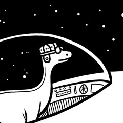
Let's start at Uneetee this week, where Radiomode has given us One Flight Down of the All Seeing Eye. It's a reworking of a piece he did for DBH's Quiksilver contest, and that it didn't win speaks volumes about how odd the selections for that contest were. To sum the design up in a word, "bold" comes to mind... it's a big print with a very visually dominant placement. The over-the-shoulder print makes the massive bird feel as though it truly is swooping down, and its head rests right at the chest, where ones eye is most easily drawn. You can't ignore the print. As for his amulet, also resting in that key visual area, the splashes of faint color help it look like it is indeed shining, and brings your eye to the eye upon it. One more proof that great shirt art turns a shirt into more.Threadless, of course, makes its own bold statements, with its regular dose of humor. Take pilihp's Arr, Let O' Me Nuts. It's probably one of my favorite "mixed" designs... no "nuts" joke intended. It's totally relatable, inasmuch as we've all done idle doodling on ads, news clippings, and the like. Seeing the clean, cartoony vectors adorning the photographed squirrels has that same quasi-vandal humor, made stronger by both the sheer concentrated effort to make them into pirates, and the adorable ridiculousness of that final image. The added accessories really do fit smartly on the images of the rodents, skillfully tailored by the designer. I also really like their transparency... not only does it hammer home the add-on quality, but it gives them an almost imagined feel, as though the squirrels are fancying themselves as swashbucklers, which I have to admit is pretty hilarious. In a way, squirrels are pirate-like... always stealing booty and hiding it away as though making their own treasure maps. I think it'd be great if they could actually picture themselves that way, as well.If your jokes need to be punchier, though, I cannot say enough good things about Pictograms Can be Tricky. This rodrigobhz tee has a killer uppercut of a punchline using some smart parody. It's put together with a smart cartoon style that really gets the joke across and makes the graphic attractive enough to be wearable. What really makes a joke like this a winner, though, is how creative it is... it's easy to be funny, or even be unexpectedly funny, but to pull out a joke that is so unexpected that you know you'd never have thought of it, but so perfect that you'll never be able to unthink it, takes a certain flash of brilliance. And this has it.More subtly, though, we've got something as well. But where the last few pieces were all about bold humor, big laughs, and getting attention, Swan Tangle's humor is a smile, not a guffaw. Which is perfectly fine, because the biggest bit of charm in Aquarium's tee is not the humor. Sure, the pigpile of birds, all for one little fish, has its own humor, but there's way more to it for me. It's about the visual intrigue of those twisting necks, entwining over and around and under even more dramatically than they can in real life. It's about the skilled rendering of the swans... there's great detail and shading in making them what they are on the shirt. It's about the shape they make, which is just wonderful. For me, though, one of the greatest things about this is the color scheme. I think swans have a pretty damn great color scheme in and of themselves, but that pure white, not to mention the bold orange of their bills and the fish, really looks stunning against the deep royal blue. There's just enough concept to add a flourish to the art, but the artistic choices are what really make this a flawless tee (and the second gorgeous swan tee I'll be buying from Threadless, at that).Finally, to Design By Humans, which ends similarly to how we opened. Rho Fiera/Black Diamond is almost the opposite of Radiomode's tee, insofar as the left shoulder is the only part of it that ISN'T a print. I'd imagine the design's massive white space would end up being a discharge print if it made it to print. Anyway, speculation aside, Ibis's ode to geometry (and possibly playing cards) is another bold one. The bulk of the design, an infrastructure of rods and points forming diamonds and triangles, is on the chest, which is classically the least creative place to stick a tee graphic, but the way it inhabits the shirt is what makes it so good... it feels like the red is encrouching on the white, flowing in via that infrastructure and taking over. It's interesting that the rigid geometry can create an organic flow, but that's what it seems to do. The black diamonds are great, as well, because they break up the repetition with a bold contrast. Not to mention, as a friend of mine said the last time I mentioned something with a similar color scheme, I "really will wear anything with black white and red, won't you." Not anything. But oh god is it close. Because this right here I would buy... it simply looks that good.So what makes this a plus? As I said, frequent readers would know the most likely excuse: another shirt.woot Doubletake Derby. This round, we at SingulariTee beg beg beg woot to consider their Editors Choices carefully, as the voting round seemed to be considered in any way but carefully. Yeah, if you're not hip to the woot, next week's daily selections will all be former derby entries chosen by woot staff, not woot voters. Which means they have the chance to finally not get it wrong. Now, woot's a tough egg to crack when it comes to what they'll print for ECs, and I have my gut feelings, but taking into account what I think they might print vs. what I'd like to see printed, I'm going to postulate the following: the lush, summery greens and skillful lines of Drakxxx's Wise Old Master; the smart and funny personification of rglee129's Technophilia; the brilliant quirkiness of EdgarRMcHerly's Oh S-Word! It's Atlas; and the stark, bold black and white of Dekonstruct's Brontosnorus Saves the World. As per usual, the roundup will come some time after next week's Contest Watch.
Requiem for a Jim
 When I first "met" Jimiyo, I was unimpressed. In retrospect, I can't pin it down. I'd imagine part of it was the lolcat tees. Maybe it was partly because the other people I respected all seemed to know him immediately, but I didn't get it immediately. Hell, now I'm that person... yknow, the one who laughs to himself when a wooter tells a Threadless artist "have you ever thought of taking this to Threadless?" Yeah, him.
But the truth of the matter is it takes very little time to like Jimiyo. He's the sort of artist who, even when you don't love his work, you can't honestly find fault in the execution. He's equally well-versed in marketing his work as he is in making work worth marketing, and he uses that skill to the benefit of other artists, not just himself. And really, you spend enough time reading his posts or chatting where he's chatting and you can't help but be drawn in by his personality. He's an all around good guy. When he's not London Beat rolling you. Jokes jokes.
So when the new Design By Humans art director becomes the new DBH shirt of the day, no one is ever going to begrudge that. It'd be a loss to the shirt world if he wasn't! As far as I'm concerned, today's tee, Rhanga (a collab with Chris Parks), is among the best he's had printed. It's the colors more than anything, but that linework is exquisite and 100% pro. The mood is perfect, really capturing the Balinese flair the two designers were going for. It straddles the line between grotesquerie and beauty. And while I can see how well designed a shirt Revelations is, and can trip over myself praising the linework and flow of Create, this is the one I feel I'd have to buy.
Code WG2XAE will still get you 10% off until May 8th, so if you're feeling the same way, pick one up, and keep an eye out for a new code in our sidebar this weekend. Also, I get the feeling Jimi might want you to follow his twitter. It's full of WIPs, cats, insights, and even free shirts. Totally worth the feed.
Tuesday, May 5, 2009
I'm Wearin' It!
 I had McDonald's last night.
In all honesty, if I'm going to have fast food at all, I'd much rather hit anywhere than McD's. I'm especially partial to tacos (see our header for more), but I'm more likely to grab Wendy's, and even then, it's rare these days that I'll go for a burger over a chicken sandwich. But yesterday I eventually decided to grab one of those wonderful greasetrap cheeseburgers... the ones you WANT to avoid, but you can't resist forever.
So in some small part, I'd like to believe I willed Design By Humans into printing today's shirt: Sonmi's tribute to everything robotic and yet also beefy, BurgBot. While the Robo-Burger may still exist only in the delicious future, the style of the illustration is firmly planted in the past: the retro style, makes it look like some forgotten fast food mascot, which gives it a nostalgic flair without a generic one. The distressed graphic helps the retro notion, as do the stars, which have a classic diner feel about them. It also has a feel like a sci-fi film of the same era, with the dramatic Superman "up-and-away" stance and the ketchup and mustard lasers. It's a totally fun shirt, and one destined to be noticed and appreciated. All that, and far more healthy than the closest alternative! No wonder I've been loving this since it was entered at Threadless. And no wonder it's a former Contest Watch mention.
Don't forget, you can save 10% at DBH with code WG2XAE until May 8th. Consider it a small consolation if you missed their sale over the last few weeks.
Monday, May 4, 2009
No, Mr. Yarn, I Expect You to Die
As you may notice, there is some very important stuff up at the top of the page. I'd advise you consider taking advantage of the links while they mean something. Especially the Pimpant. WE CAN DO IT!
 Outside of that, I'd like to commend Threadless for breaking out of their incredibly yawn-inducing 3.0+ print scheme to print a couple lower scoring pieces this week: the inexplicable "Booty Fruit" and the lovely "Eight Legged Cats Have Cool Names." The latter, as we'll recall, was a former contest watch choice. I originally loved it for its linework and the bold but small contrasts. It looks like exactly that is what we'll be getting... the piece seems to be printed quite subtly, as I'd frankly expected... Octopussy is going to simply look best in well-lighted areas... but the yellow eyes and pink yarn do their job brilliantly, giving a subtle trail for the eye to follow and wrapping around every limb, highlighting the otherwise subtle form. It's not going to be the choice of a bold-print lover, but it definitely feels a worthy print, and makes a strong (and often much-needed) case for how cute can still be artful. I await getting to see just how it looks for everyday wear, and am excited at the potential prospect of seeing the "printable score" go back to around 2.5 and above, where it belongs. Threes are good, but at the end of the day the score simply doesn't change HOW good a piece is.
Outside of that, I'd like to commend Threadless for breaking out of their incredibly yawn-inducing 3.0+ print scheme to print a couple lower scoring pieces this week: the inexplicable "Booty Fruit" and the lovely "Eight Legged Cats Have Cool Names." The latter, as we'll recall, was a former contest watch choice. I originally loved it for its linework and the bold but small contrasts. It looks like exactly that is what we'll be getting... the piece seems to be printed quite subtly, as I'd frankly expected... Octopussy is going to simply look best in well-lighted areas... but the yellow eyes and pink yarn do their job brilliantly, giving a subtle trail for the eye to follow and wrapping around every limb, highlighting the otherwise subtle form. It's not going to be the choice of a bold-print lover, but it definitely feels a worthy print, and makes a strong (and often much-needed) case for how cute can still be artful. I await getting to see just how it looks for everyday wear, and am excited at the potential prospect of seeing the "printable score" go back to around 2.5 and above, where it belongs. Threes are good, but at the end of the day the score simply doesn't change HOW good a piece is.
Subscribe to:
Posts (Atom)


